1. なぜ前段階が必要か
クラスタリングでは、データをいくつかのグループに分ける。しかし、いきなり K-means を実行しても、学生には「何を分類しているのか」がわかりにくい。
今回の本質は、地図そのものを分類することではない。太平洋上の各格子点について、1月から12月までのクロロフィル値を1本の時系列として取り出し、その形が似ている格子点をまとめることである。
2. Pre1:クロロフィル季節変動を見る・特徴量にする
Pre1では、K-meansにはまだ進まない。まず、月別の地図、代表地点の時系列、海域平均、特徴量マップを見て、クロロフィル季節変動が場所によって違うことを確認する。
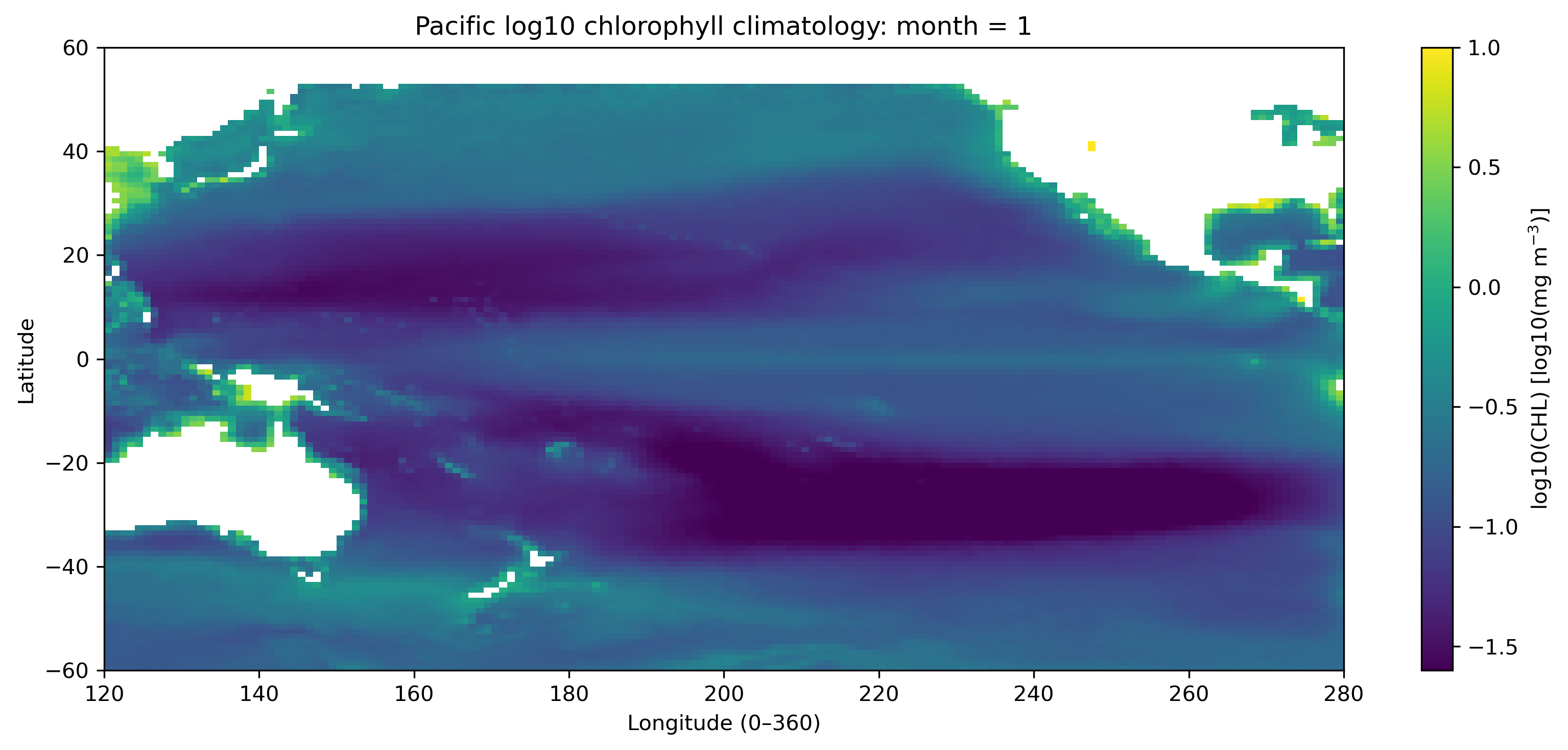
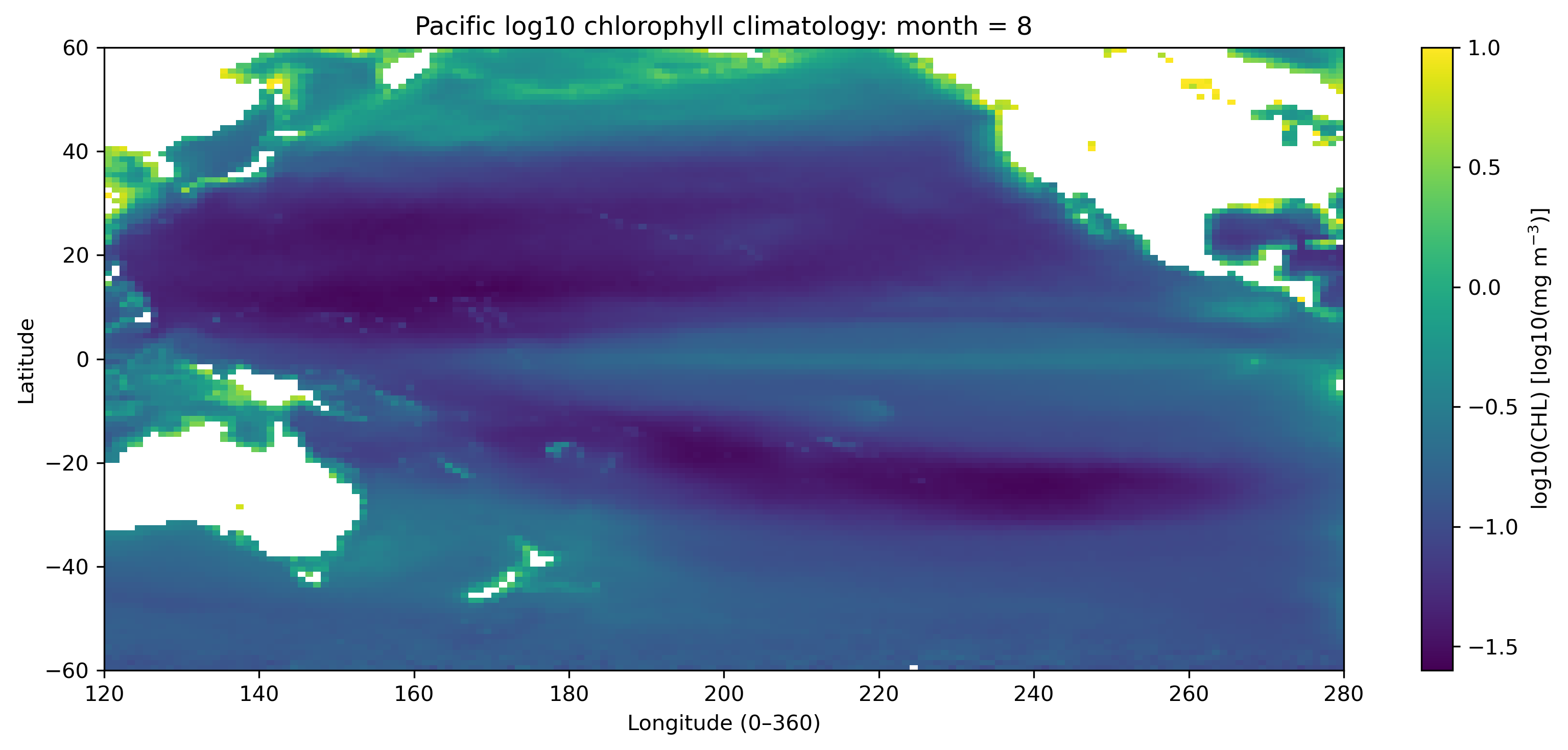
2.1 1月と8月の地図を見る
最初に、太平洋域の1月と8月の log10(CHL) 分布を比較する。これにより、北半球と南半球の季節差、赤道域、亜熱帯循環域、沿岸域の違いが見えてくる。
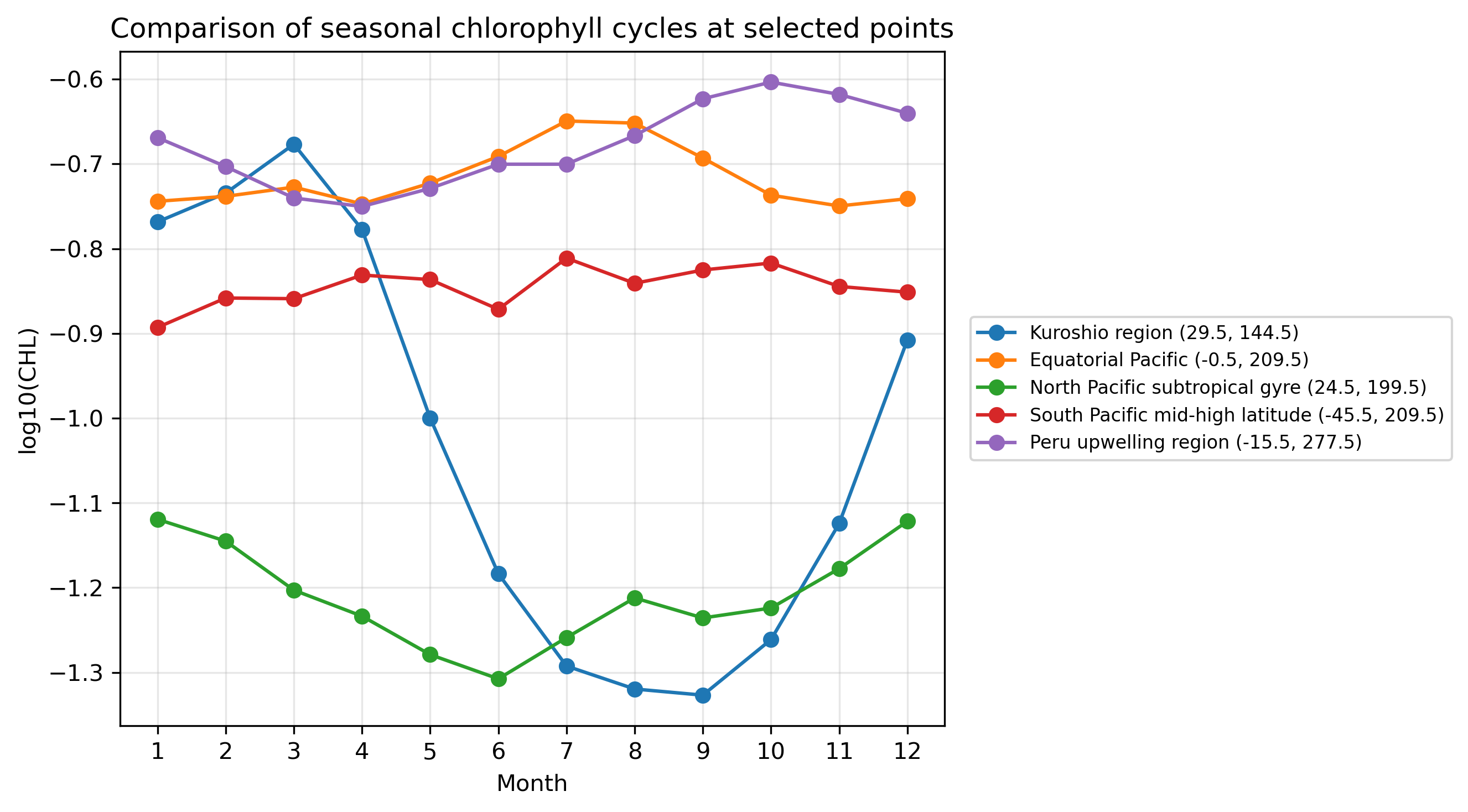
2.2 代表地点・代表海域の12か月変動を見る
代表的な地点や海域を選び、それぞれの12か月の時系列を比較する。ここで重要なのは、各格子点に「12か月の値」があるという感覚をつかむことである。
2.3 12か月時系列から特徴量を作る
12か月の時系列は、そのまま見るだけでなく、年平均、季節振幅、標準偏差、最大月などに要約できる。これが「特徴量を作る」という操作である。
| 特徴量 | 意味 |
|---|---|
| 年平均 | その格子点が全体的に高クロロフィルか低クロロフィルか。 |
| 季節振幅 | 最大値 − 最小値。季節変動の大きさ。 |
| 最大月 | 12か月のうちクロロフィルが最も高い月。 |
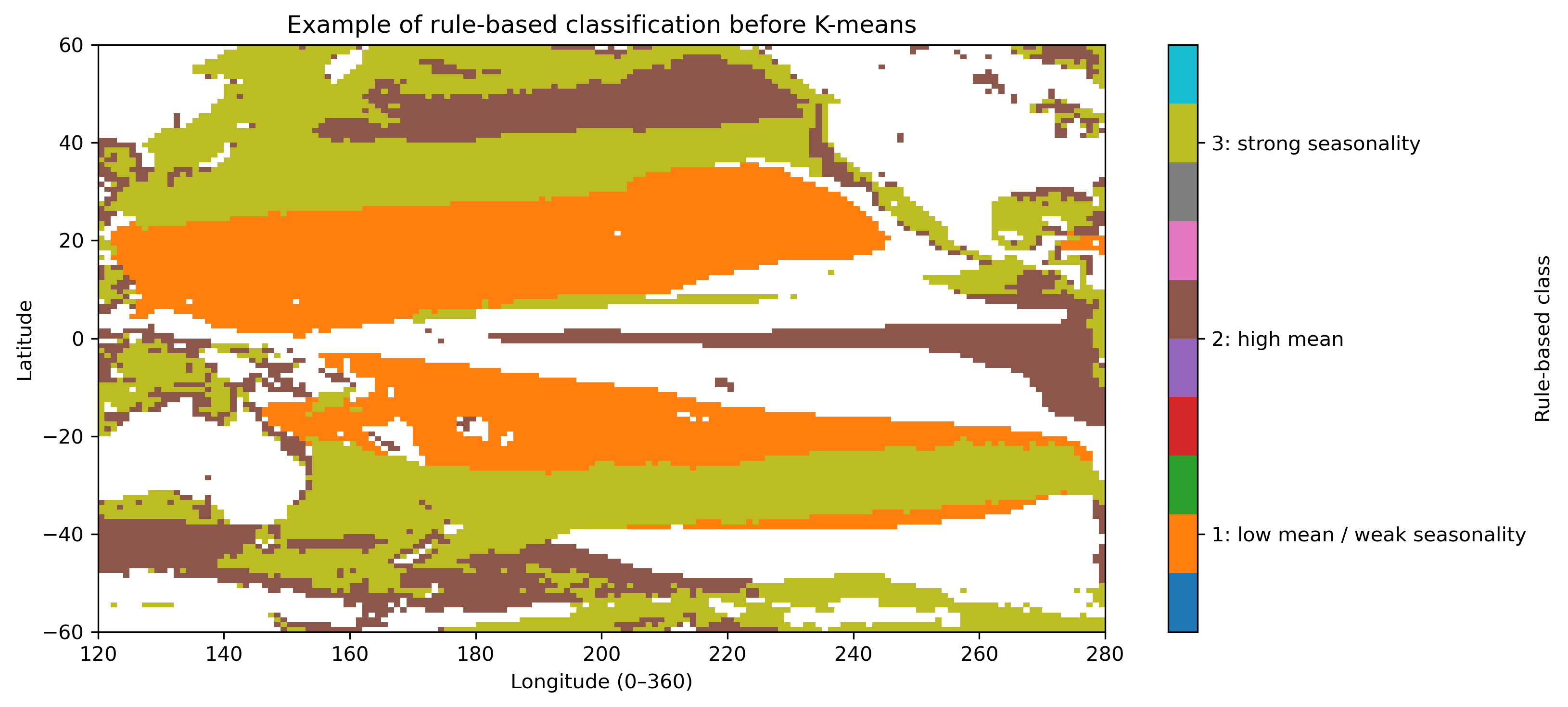
2.4 手作業で分類するとどうなるか
平均と振幅だけを使って、人間がルールで分類することもできる。ただし、しきい値や条件の順番で結果は変わる。これは「正解」ではなく、手作業分類の限界を見るための参考図である。
3. Pre1:セルごとの実行コード
以下をJupyter Labのセルに1つずつ貼り付けて実行する。各STEPの図が出たら、本文の説明と対応させて確認する。
データファイル GlobColour_log10CHL1_clim12_100km_AV_199709_202603.nc は、このHTMLやノートブックと同じフォルダに置く想定である。
STEP 1:ライブラリ・ファイル名・保存先を設定する
# ============================================================
# Pre1 STEP 1
# ライブラリ・ファイル名・保存先を設定する
# ============================================================

from pathlib import Path

import numpy as np
import xarray as xr
import matplotlib.pyplot as plt

# NetCDFファイルを置いたフォルダ
# 同じフォルダに置いた場合は Path(".") でよい
base_dir = Path(".")

# 入力ファイル名
ncfile = base_dir / "GlobColour_log10CHL1_clim12_100km_AV_199709_202603.nc"

# 図の保存先
figdir = base_dir / "figures_14p5_chl_pre1"
figdir.mkdir(parents=True, exist_ok=True)

# 太平洋域の範囲
lat_min, lat_max = -60, 60
lon_min, lon_max = 120, 280   # 0–360表記。280E = 80W

print("Input file:", ncfile)
print("Exists:", ncfile.exists())
print("Figure directory:", figdir)

if not ncfile.exists():
    raise FileNotFoundError(f"ファイルが見つかりません: {ncfile}")


def save_current_figure(filename):
    """現在の図をPNGで保存する。"""
    out_png = figdir / filename
    plt.savefig(out_png, dpi=300, bbox_inches="tight", facecolor="white")
    print("Saved:", out_png)
STEP 2:NetCDFを読み、太平洋域を切り出す
# ============================================================
# Pre1 STEP 2
# NetCDFを読み、太平洋域を切り出す
# ============================================================

# データを開く
ds = xr.open_dataset(ncfile)
print(ds)

# 変数を取り出す
chl = ds["log10_chl_clim"]

print("Original dims :", chl.dims)
print("Original shape:", chl.shape)
print("Original lat range:", float(chl.lat.min()), float(chl.lat.max()))
print("Original lon range:", float(chl.lon.min()), float(chl.lon.max()))

# latを昇順にそろえる
chl = chl.sortby("lat")

# lonを0–360表記にする
chl = chl.assign_coords(lon=(chl["lon"] + 360) % 360)
chl = chl.sortby("lon")

# 太平洋域を切り出す
chl_pac = chl.sel(
    lat=slice(lat_min, lat_max),
    lon=slice(lon_min, lon_max)
)

print("Pacific dims :", chl_pac.dims)
print("Pacific shape:", chl_pac.shape)
print("Pacific lat range:", float(chl_pac.lat.min()), float(chl_pac.lat.max()))
print("Pacific lon range:", float(chl_pac.lon.min()), float(chl_pac.lon.max()))
STEP 3:1月と8月の地図を描く
# ============================================================
# Pre1 STEP 3
# 1月と8月の地図を描く
# ============================================================

for m in [1, 8]:
    da = chl_pac.sel(month=m)

    plt.figure(figsize=(11, 5))
    im = plt.pcolormesh(
        chl_pac["lon"],
        chl_pac["lat"],
        da,
        shading="auto",
        vmin=-1.6,
        vmax=1.0
    )
    plt.colorbar(im, label="log10(CHL) [log10(mg m$^{-3}$)]")
    plt.xlabel("Longitude (0–360)")
    plt.ylabel("Latitude")
    plt.title(f"Pacific log10 chlorophyll climatology: month = {m}")
    plt.xlim(lon_min, lon_max)
    plt.ylim(lat_min, lat_max)
    plt.tight_layout()

    save_current_figure(f"pre1_map_log10chl_month{m:02d}.png")
    plt.show()
STEP 4:代表地点の12か月時系列を比較する
# ============================================================
# Pre1 STEP 4
# 代表地点の12か月時系列を比較する
# ============================================================

# 代表地点:lonは0–360表記で指定する
points = {
    "Kuroshio region": (30.0, 145.0),
    "Equatorial Pacific": (0.0, 210.0),
    "North Pacific subtropical gyre": (25.0, 200.0),
    "South Pacific mid-high latitude": (-45.0, 170.0),
    "Peru upwelling region": (-15.0, 275.0),
}

months = chl_pac["month"].values

plt.figure(figsize=(11, 5))

for name, (plat, plon) in points.items():
    # 最も近い有効格子点を選ぶ
    ts = chl_pac.sel(lat=plat, lon=plon, method="nearest")
    actual_lat = float(ts["lat"].values)
    actual_lon = float(ts["lon"].values)

    plt.plot(
        months,
        ts.values,
        marker="o",
        label=f"{name} ({actual_lat:.1f}, {actual_lon:.1f})"
    )

plt.xlabel("Month")
plt.ylabel("log10(CHL)")
plt.title("Comparison of seasonal chlorophyll cycles at selected points")
plt.xticks(months)
plt.grid(True, alpha=0.3)
plt.legend(fontsize=9)
plt.tight_layout()

save_current_figure("pre1_compare_selected_points.png")
plt.show()

# 代表地点を1つずつ個別に描く
for name, (plat, plon) in points.items():
    ts = chl_pac.sel(lat=plat, lon=plon, method="nearest")
    actual_lat = float(ts["lat"].values)
    actual_lon = float(ts["lon"].values)

    safe_name = name.replace(" ", "_").replace("-", "_")

    plt.figure(figsize=(8, 5))
    plt.plot(months, ts.values, marker="o")
    plt.xlabel("Month")
    plt.ylabel("log10(CHL)")
    plt.title(f"{name}\nvalid grid: lat={actual_lat:.1f}, lon={actual_lon:.1f}")
    plt.xticks(months)
    plt.grid(True, alpha=0.3)
    plt.tight_layout()

    save_current_figure(f"pre1_point_timeseries_{safe_name}.png")
    plt.show()
STEP 5:代表海域の平均季節変動を見る
# ============================================================
# Pre1 STEP 5
# 代表海域の平均季節変動を見る
# ============================================================

# 緯度範囲, 経度範囲を指定する
regions = {
    "Kuroshio": {
        "lat": (25, 35),
        "lon": (135, 155),
    },
    "Equatorial_Pacific": {
        "lat": (-5, 5),
        "lon": (190, 240),
    },
    "North_Pacific_Subtropical_Gyre": {
        "lat": (15, 30),
        "lon": (180, 230),
    },
    "South_Pacific_MidLat": {
        "lat": (-50, -35),
        "lon": (160, 210),
    },
    "Peru_Upwelling": {
        "lat": (-25, -5),
        "lon": (260, 280),
    },
}

plt.figure(figsize=(10, 5))

for name, reg in regions.items():
    lat1, lat2 = reg["lat"]
    lon1, lon2 = reg["lon"]

    sub = chl_pac.sel(lat=slice(lat1, lat2), lon=slice(lon1, lon2))

    # 緯度経度方向に平均して、monthだけを残す
    cycle = sub.mean(dim=("lat", "lon"), skipna=True)

    plt.plot(months, cycle.values, marker="o", label=name)

plt.xlabel("Month")
plt.ylabel("Area-mean log10(CHL)")
plt.title("Area-mean seasonal chlorophyll cycles")
plt.xticks(months)
plt.grid(True, alpha=0.3)
plt.legend()
plt.tight_layout()

save_current_figure("pre1_area_mean_seasonal_cycles.png")
plt.show()
STEP 6:年平均・季節振幅・最大月を計算して地図にする
# ============================================================
# Pre1 STEP 6
# 年平均・季節振幅・最大月を計算して地図にする
# ============================================================
annual_mean = chl_pac.mean(dim="month", skipna=True)
annual_max = chl_pac.max(dim="month", skipna=True)
annual_min = chl_pac.min(dim="month", skipna=True)
# 季節振幅 = 最大値 - 最小値
amplitude = annual_max - annual_min
# 12か月の標準偏差
annual_std = chl_pac.std(dim="month", skipna=True)
# 最大月
max_month = chl_pac.idxmax(dim="month", skipna=True)
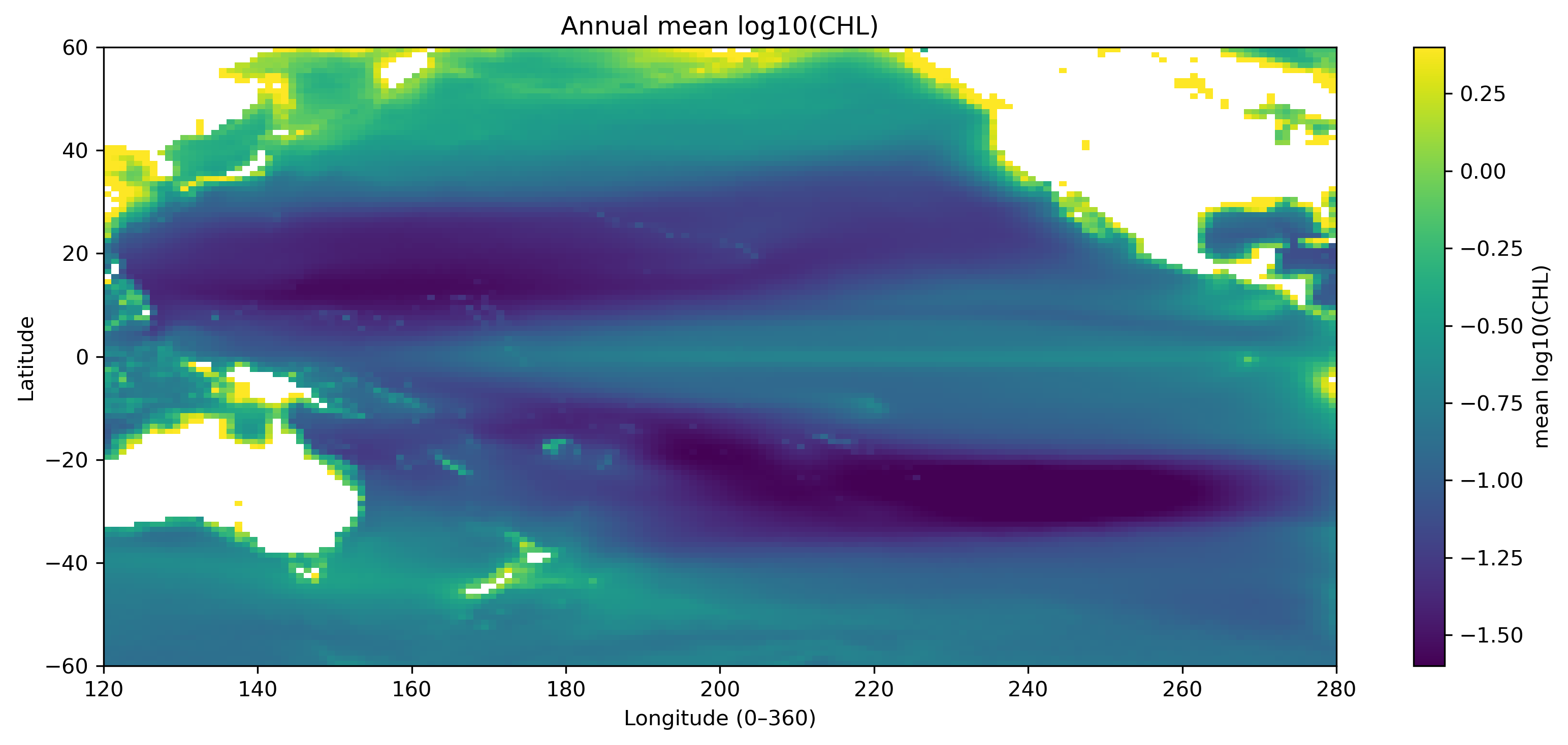
# ---- 年平均 ----
plt.figure(figsize=(11, 5))
im = plt.pcolormesh(
chl_pac["lon"], chl_pac["lat"], annual_mean,
shading="auto",
vmin=-1.6, vmax=0.4
)
plt.colorbar(im, label="mean log10(CHL)")
plt.xlabel("Longitude (0–360)")
plt.ylabel("Latitude")
plt.title("Annual mean log10(CHL)")
plt.xlim(lon_min, lon_max)
plt.ylim(lat_min, lat_max)
plt.tight_layout()
save_current_figure("pre1_feature_annual_mean.png")
plt.show()
# ---- 季節振幅 ----
plt.figure(figsize=(11, 5))
im = plt.pcolormesh(
chl_pac["lon"], chl_pac["lat"], amplitude,
shading="auto",
vmin=0.0, vmax=1.6
)
plt.colorbar(im, label="max - min in log10(CHL)")
plt.xlabel("Longitude (0–360)")
plt.ylabel("Latitude")
plt.title("Seasonal amplitude of log10(CHL)")
plt.xlim(lon_min, lon_max)
plt.ylim(lat_min, lat_max)
plt.tight_layout()
save_current_figure("pre1_feature_amplitude.png")
plt.show()
# ---- 標準偏差 ----
plt.figure(figsize=(11, 5))
im = plt.pcolormesh(
chl_pac["lon"], chl_pac["lat"], annual_std,
shading="auto",
vmin=0.0, vmax=0.7
)
plt.colorbar(im, label="std of monthly log10(CHL)")
plt.xlabel("Longitude (0–360)")
plt.ylabel("Latitude")
plt.title("Seasonal standard deviation of log10(CHL)")
plt.xlim(lon_min, lon_max)
plt.ylim(lat_min, lat_max)
plt.tight_layout()
save_current_figure("pre1_feature_annual_std.png")
plt.show()
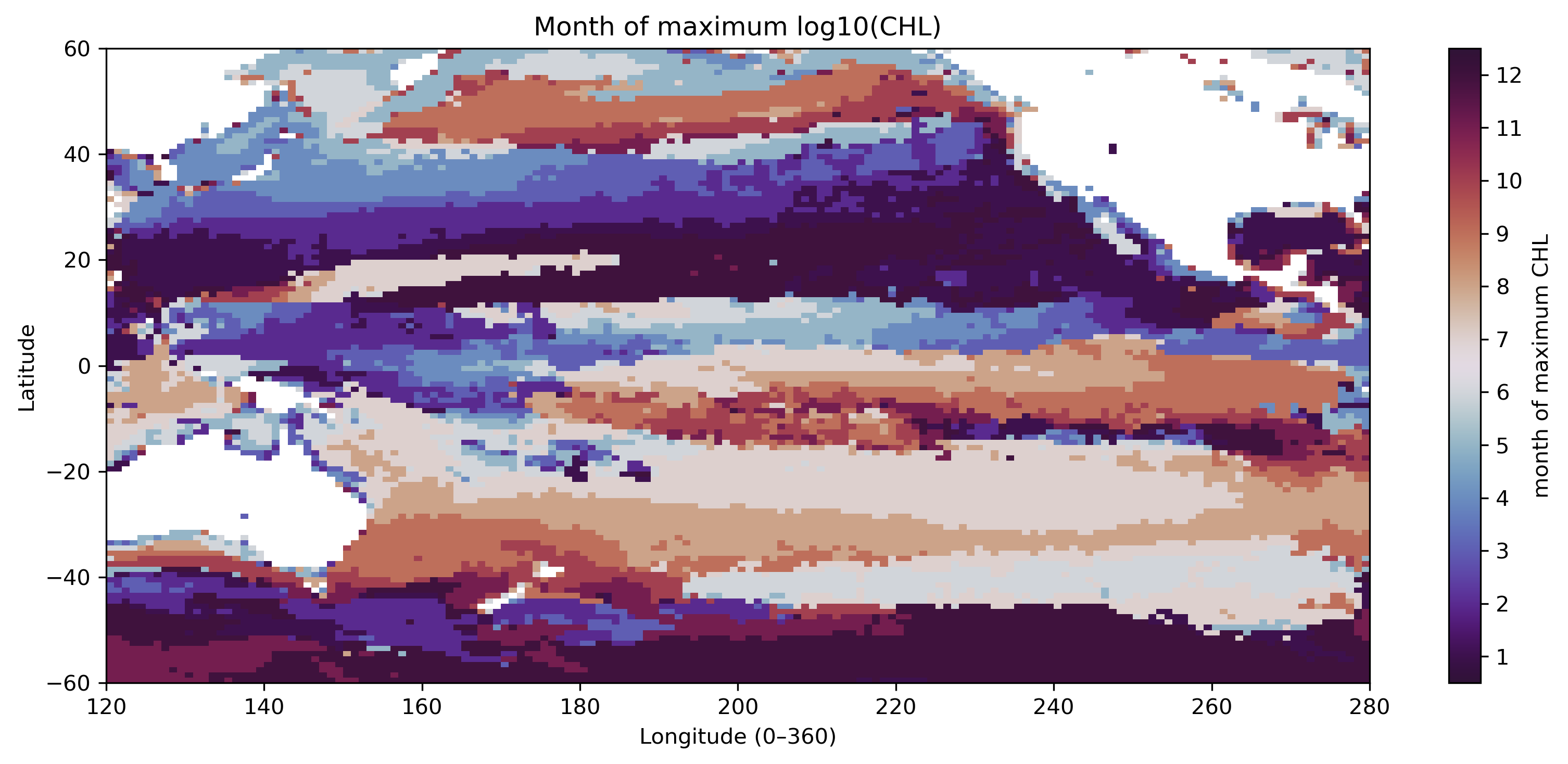
# ---- 最大月 ----
plt.figure(figsize=(11, 5))
im = plt.pcolormesh(
chl_pac["lon"], chl_pac["lat"], max_month,
shading="auto",
vmin=1, vmax=12,
cmap="twilight_shifted"
)
plt.colorbar(im, label="month of maximum CHL")
plt.xlabel("Longitude (0–360)")
plt.ylabel("Latitude")
plt.title("Month of maximum log10(CHL)")
plt.xlim(lon_min, lon_max)
plt.ylim(lat_min, lat_max)
plt.tight_layout()
save_current_figure("pre1_feature_max_month.png")
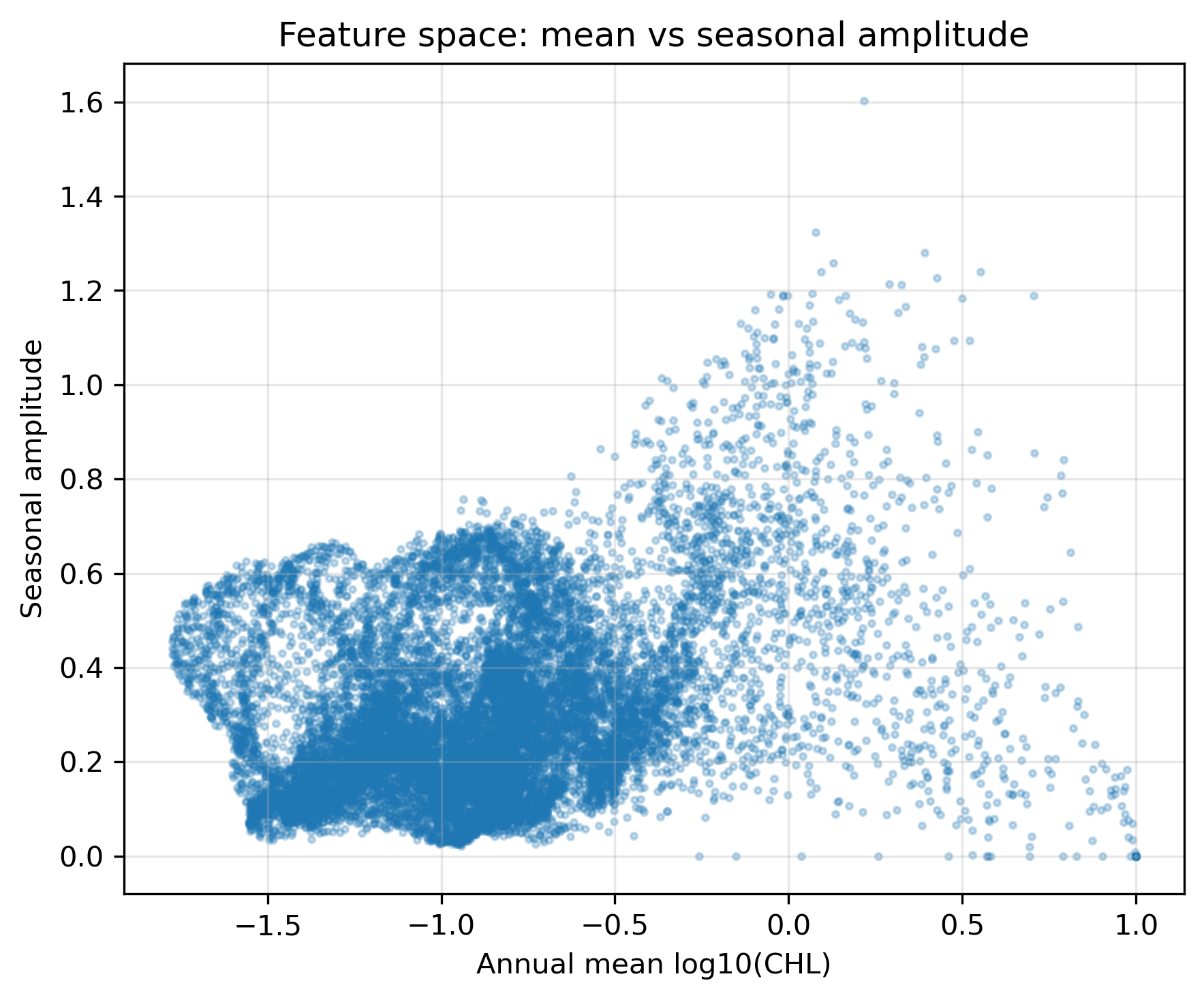
plt.show()STEP 7:特徴量空間と簡単なルール分類を見る
# ============================================================
# Pre1 STEP 7
# 特徴量空間と簡単なルール分類を見る
# ============================================================

mean_vals = annual_mean.values.ravel()
amp_vals = amplitude.values.ravel()
valid_feature = np.isfinite(mean_vals) & np.isfinite(amp_vals)

plt.figure(figsize=(8, 6))
plt.scatter(
    mean_vals[valid_feature],
    amp_vals[valid_feature],
    s=8,
    alpha=0.25
)
plt.xlabel("Annual mean log10(CHL)")
plt.ylabel("Seasonal amplitude")
plt.title("Feature space: mean vs seasonal amplitude")
plt.grid(True, alpha=0.3)
plt.tight_layout()
save_current_figure("pre1_feature_scatter_mean_vs_amplitude.png")
plt.show()

# ------------------------------------------------------------
# これはK-meansではない。
# 人間が平均と振幅にしきい値を置いた場合の例である。
# ------------------------------------------------------------

rule_class = xr.full_like(annual_mean, np.nan)

# 1: 低CHL・弱季節変動
rule_class = rule_class.where(~((annual_mean < -0.8) & (amplitude < 0.45)), 1)

# 2: 高CHL
rule_class = rule_class.where(~(annual_mean >= -0.4), 2)

# 3: 強い季節変動
rule_class = rule_class.where(~(amplitude >= 0.45), 3)

plt.figure(figsize=(11, 5))
im = plt.pcolormesh(
    chl_pac["lon"], chl_pac["lat"], rule_class,
    shading="auto",
    cmap="tab10",
    vmin=0.5, vmax=3.5
)
cbar = plt.colorbar(im, label="Rule-based class")
cbar.set_ticks([1, 2, 3])
cbar.set_ticklabels([
    "1: low mean / weak seasonality",
    "2: high mean",
    "3: strong seasonality",
])
plt.xlabel("Longitude (0–360)")
plt.ylabel("Latitude")
plt.title("Simple rule-based classification before K-means")
plt.xlim(lon_min, lon_max)
plt.ylim(lat_min, lat_max)
plt.tight_layout()
save_current_figure("pre1_rule_based_classification.png")
plt.show()

# NetCDFを閉じる
ds.close()
4. Pre2:X(grid, month) を作る
Pre2では、K-means本編につながるデータ行列 X(grid, month) を作る。ここでもまだクラスタリングはしない。まず「Xとは何か」を理解する。
4.1 3次元データから2次元行列へ
元データは chl_pac(month, lat, lon) である。これは「12か月分の地図が重なっている」と考えられる。一方、K-meansに渡すためには、各格子点を1行に並べた2次元行列が必要である。
元データ
K-means用の行列
つまり、Xの1行は1つの格子点、Xの12列は1月〜12月のクロロフィル値である。
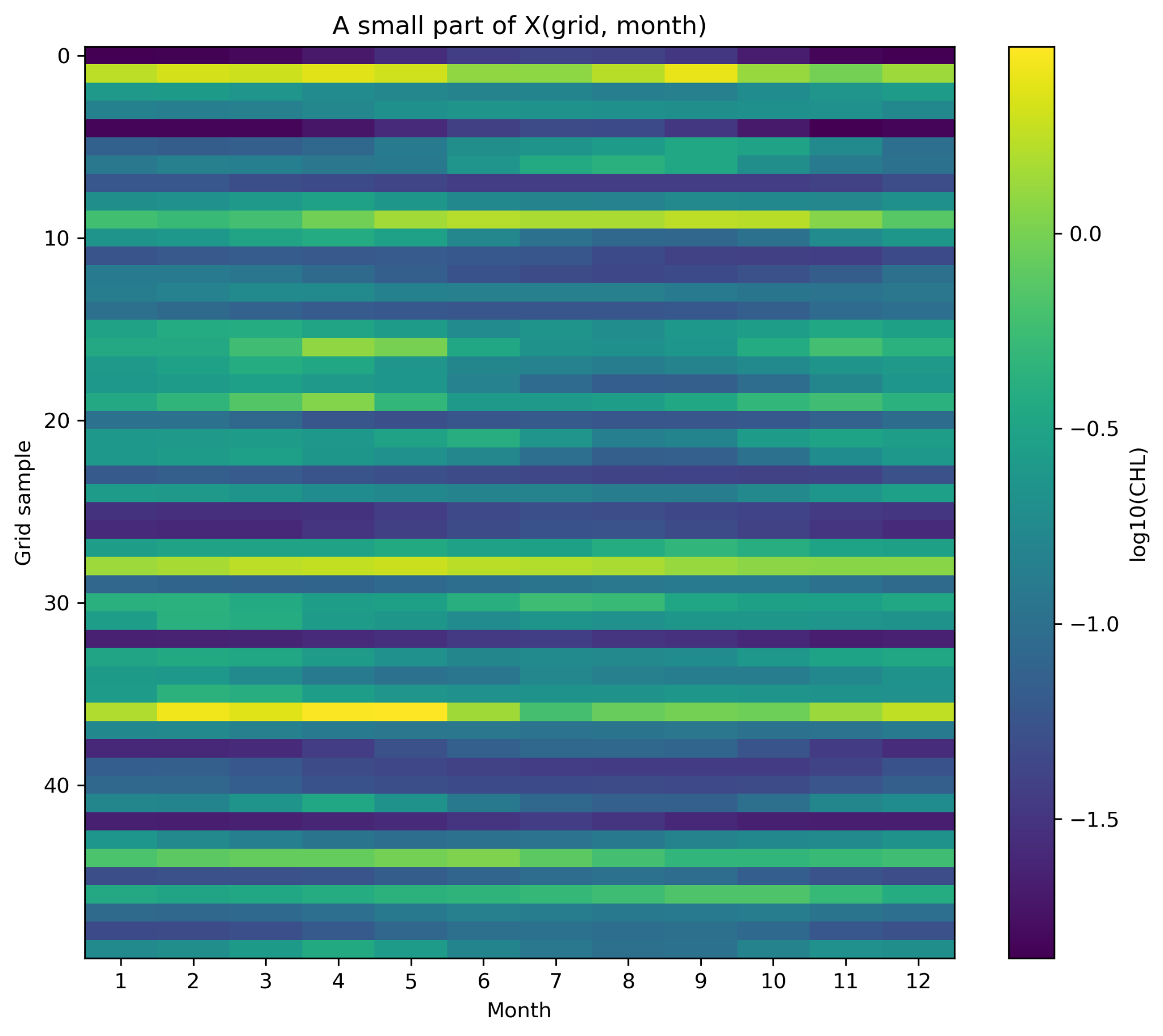
4.2 Xの一部をヒートマップで見る
次の図では、Xの全行ではなく、50個程度の格子点を抜き出して表示している。横軸が月、縦軸が抜き出した格子点番号、色が log10(CHL) である。
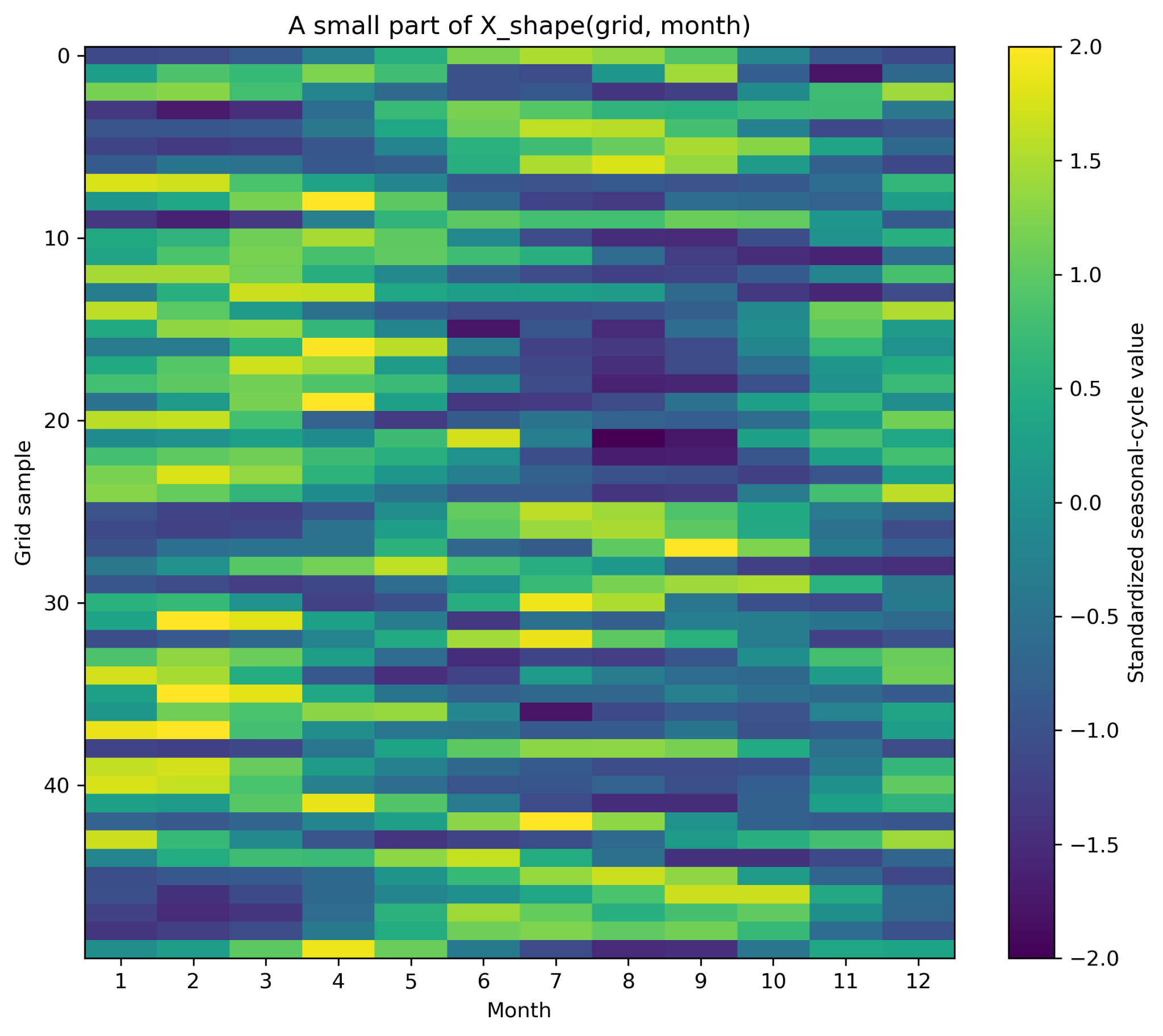
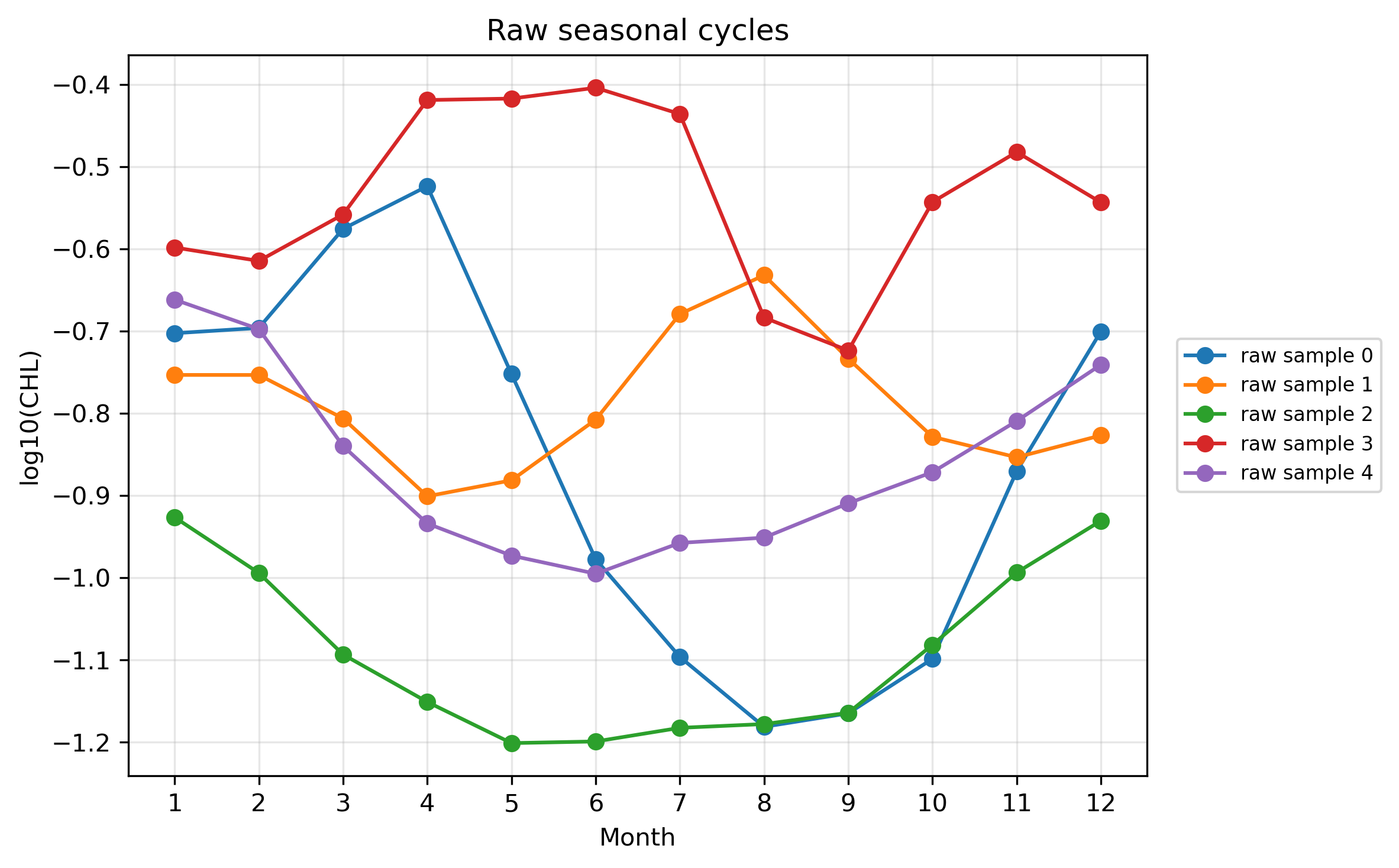
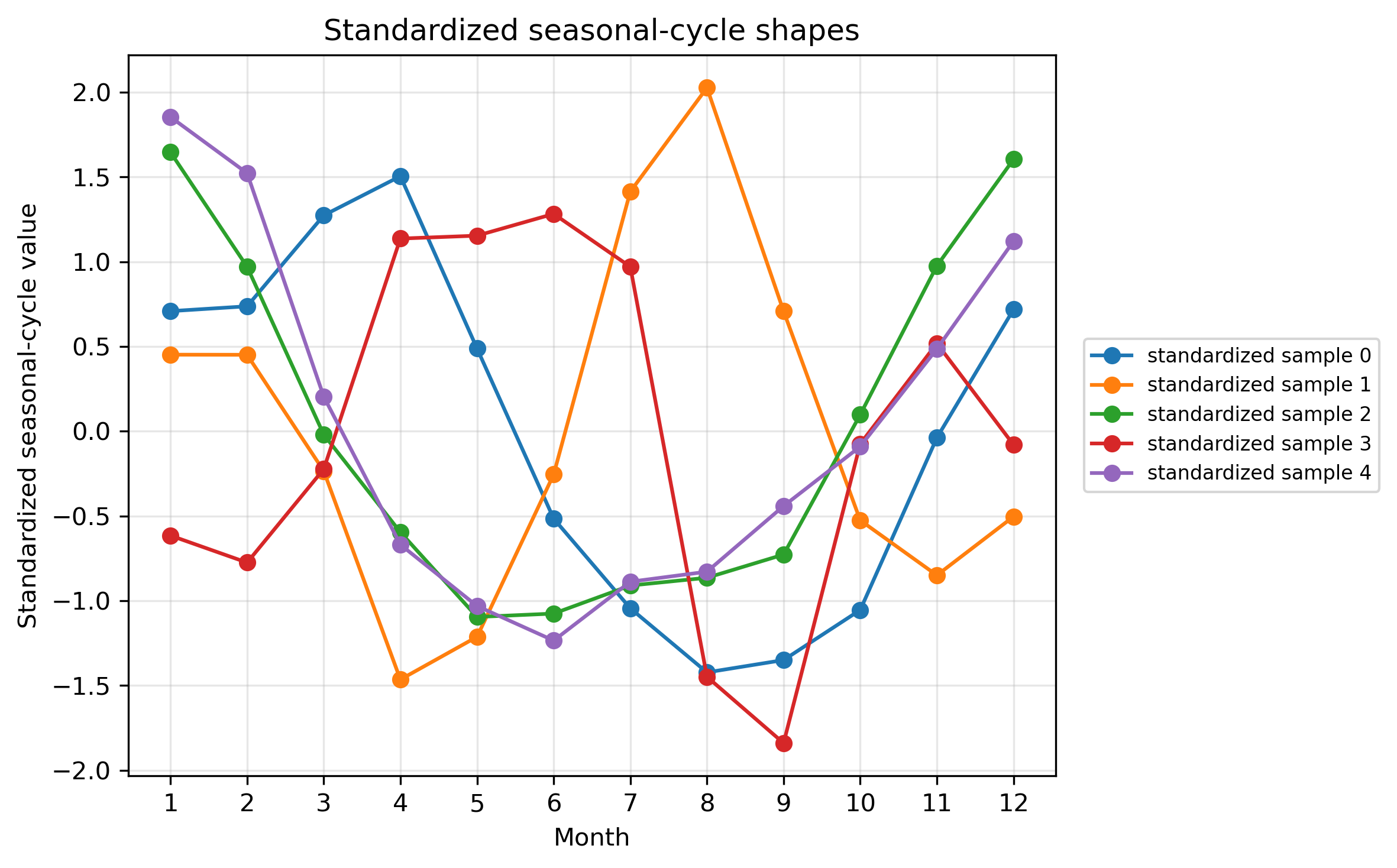
4.3 raw値と標準化値の違い
raw値のXでは、クロロフィル濃度の高低と季節変動の形が両方残っている。季節変動の形だけを比較したい場合は、各格子点ごとに12か月平均を引き、12か月標準偏差で割る。
X_shape = (X_valid2 - X_mean2) / X_std2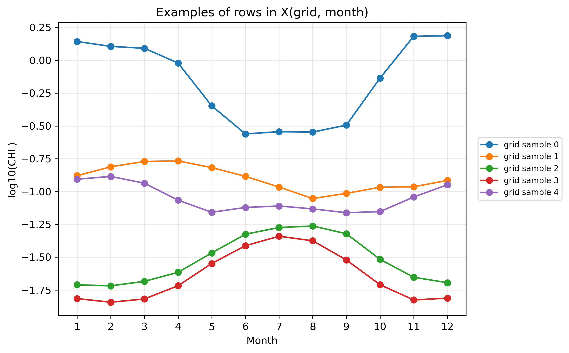
5. Pre2:セルごとの実行コード
Pre2もセルごとに分けて実行する。特にSTEP 3の reshape が、このページの山場である。
STEP 1:ライブラリ・設定・保存先を用意する
# ============================================================
# Pre2 STEP 1
# ライブラリ・設定・保存先を用意する
# ============================================================

from pathlib import Path

import numpy as np
import xarray as xr
import matplotlib.pyplot as plt

base_dir = Path(".")
ncfile = base_dir / "GlobColour_log10CHL1_clim12_100km_AV_199709_202603.nc"

figdir = base_dir / "figures_14p5_chl_pre2"
figdir.mkdir(parents=True, exist_ok=True)

lat_min, lat_max = -60, 60
lon_min, lon_max = 120, 280

# ランダム抽出の再現性を固定する
rng = np.random.default_rng(0)

print("Input file:", ncfile)
print("Exists:", ncfile.exists())
print("Figure directory:", figdir)

if not ncfile.exists():
    raise FileNotFoundError(f"ファイルが見つかりません: {ncfile}")


def save_current_figure(filename):
    out_png = figdir / filename
    plt.savefig(out_png, dpi=300, bbox_inches="tight", facecolor="white")
    print("Saved:", out_png)
STEP 2:データを読み、太平洋域を切り出す
# ============================================================
# Pre2 STEP 2
# データを読み、太平洋域を切り出す
# ============================================================

ds = xr.open_dataset(ncfile)
chl = ds["log10_chl_clim"]

# latを昇順にする
chl = chl.sortby("lat")

# lonを0–360表記にする
chl = chl.assign_coords(lon=(chl["lon"] + 360) % 360)
chl = chl.sortby("lon")

# 太平洋域を切り出す
chl_pac = chl.sel(
    lat=slice(lat_min, lat_max),
    lon=slice(lon_min, lon_max)
)

print("chl_pac dims :", chl_pac.dims)
print("chl_pac shape:", chl_pac.shape)
STEP 3:chl(month, lat, lon) を X(grid, month) に変形する
# ============================================================
# Pre2 STEP 3
# chl(month, lat, lon) を X(grid, month) に変形する
# ============================================================

# K-meansでは、1格子点を1サンプルとして扱いたい。
# そのため、配列を (lat, lon, month) の順番に並べ替える。
chl_for_cluster = chl_pac.transpose("lat", "lon", "month")

lat = chl_for_cluster["lat"].values
lon = chl_for_cluster["lon"].values
months = chl_for_cluster["month"].values

nlat = len(lat)
nlon = len(lon)
nmon = len(months)

print("nlat:", nlat)
print("nlon:", nlon)
print("nmon:", nmon)

A = chl_for_cluster.values              # shape = (lat, lon, month)
X = A.reshape(nlat * nlon, nmon)        # shape = (grid, month)

print("A shape:", A.shape)
print("X shape:", X.shape)
print("Xの1行 = 1つの格子点の12か月時系列")
print("Xの1列 = ある月の全格子点の値")

# 12か月すべてに値がある格子点だけ使う
valid_grid = np.isfinite(X).all(axis=1)
X_valid = X[valid_grid, :]

# validな格子点の緯度経度も取り出す
lon2d, lat2d = np.meshgrid(lon, lat)
lat_flat = lat2d.ravel()
lon_flat = lon2d.ravel()
lat_valid = lat_flat[valid_grid]
lon_valid = lon_flat[valid_grid]

print("Total grid points:", X.shape[0])
print("Valid grid points:", X_valid.shape[0])
STEP 4:Xの一部をヒートマップで見る
# ============================================================
# Pre2 STEP 4
# Xの一部をヒートマップで見る
# ============================================================

# 表示するサンプル数
n_show = 50

# 季節変動が少し見えやすい格子点からランダムに選ぶ
amp_each_grid = np.nanmax(X_valid, axis=1) - np.nanmin(X_valid, axis=1)
candidate_indices = np.where(amp_each_grid >= 0.20)[0]

# 候補が少なすぎる場合は、すべての有効格子点から選ぶ
if len(candidate_indices) < n_show:
    candidate_indices = np.arange(X_valid.shape[0])

sample_indices = rng.choice(candidate_indices, size=n_show, replace=False)
X_show = X_valid[sample_indices, :]

plt.figure(figsize=(8, 7))
im = plt.imshow(
    X_show,
    aspect="auto",
    origin="upper",
    interpolation="nearest"
)
plt.colorbar(im, label="log10(CHL)")
plt.xlabel("Month")
plt.ylabel("Sampled grid index")
plt.title("50 sampled rows from X(grid, month)")
plt.xticks(ticks=np.arange(12), labels=months)
plt.tight_layout()
save_current_figure("pre2_X_matrix_heatmap.png")
plt.show()
STEP 5:Xの行を折れ線として描く
# ============================================================
# Pre2 STEP 5
# Xの行を折れ線として描く
# ============================================================

# さきほど選んだ50個のうち、最初の5個だけ折れ線で描く
n_line = 5
line_indices = sample_indices[:n_line]

plt.figure(figsize=(9, 5))
for i, idx in enumerate(line_indices):
    plt.plot(
        months,
        X_valid[idx, :],
        marker="o",
        label=f"grid sample {i}"
    )

plt.xlabel("Month")
plt.ylabel("log10(CHL)")
plt.title("Examples of rows in X(grid, month)")
plt.xticks(months)
plt.grid(True, alpha=0.3)
plt.legend()
plt.tight_layout()
save_current_figure("pre2_examples_rows_in_X_amplitude_filtered_random.png")
plt.show()
STEP 6:各格子点ごとに標準化して X_shape を作る
# ============================================================
# Pre2 STEP 6
# 各格子点ごとに標準化して X_shape を作る
# ============================================================

# 各行ごとに、12か月平均と12か月標準偏差を計算する
X_mean = np.nanmean(X_valid, axis=1, keepdims=True)
X_std  = np.nanstd(X_valid, axis=1, keepdims=True)

# 標準偏差が0の格子点は除く
valid_std = np.squeeze(X_std > 0)

X_valid2 = X_valid[valid_std, :]
X_mean2 = X_mean[valid_std, :]
X_std2 = X_std[valid_std, :]

lat_valid2 = lat_valid[valid_std]
lon_valid2 = lon_valid[valid_std]

# 標準化
X_shape = (X_valid2 - X_mean2) / X_std2

print("X_valid shape:", X_valid.shape)
print("X_shape shape:", X_shape.shape)
print("X_shape全体の平均:", np.nanmean(X_shape))
print("X_shape全体の標準偏差:", np.nanstd(X_shape))

# STEP 4と同じサンプル番号を、valid_std後の番号へ対応させる
# 簡単のため、ここではX_shapeから改めて50個選ぶ
amp_shape_base = np.nanmax(X_valid2, axis=1) - np.nanmin(X_valid2, axis=1)
candidate_shape = np.where(amp_shape_base >= 0.20)[0]
if len(candidate_shape) < n_show:
    candidate_shape = np.arange(X_shape.shape[0])

sample_indices_shape = rng.choice(candidate_shape, size=n_show, replace=False)
X_shape_show = X_shape[sample_indices_shape, :]

plt.figure(figsize=(8, 7))
im = plt.imshow(
    X_shape_show,
    aspect="auto",
    origin="upper",
    interpolation="nearest",
    vmin=-2,
    vmax=2
)
plt.colorbar(im, label="Standardized seasonal-cycle value")
plt.xlabel("Month")
plt.ylabel("Sampled grid index")
plt.title("50 sampled rows from X_shape(grid, month)")
plt.xticks(ticks=np.arange(12), labels=months)
plt.tight_layout()
save_current_figure("pre2_X_shape_matrix_heatmap.png")
plt.show()
STEP 7:raw値と標準化後の形を比較する
# ============================================================
# Pre2 STEP 7
# raw値と標準化後の形を比較する
# ============================================================
# 同じ格子点を5個選んで、rawとstandardizedを比較する
n_line = 5
line_indices_shape = sample_indices_shape[:n_line]
plt.figure(figsize=(9, 5))
for i, idx in enumerate(line_indices_shape):
plt.plot(
months,
X_valid2[idx, :],
marker="o",
label=f"raw sample {i}"
)
plt.xlabel("Month")
plt.ylabel("log10(CHL)")
plt.title("Raw seasonal cycles")
plt.xticks(months)
plt.grid(True, alpha=0.3)
plt.legend()
plt.tight_layout()
save_current_figure("pre2_raw_examples_amplitude_filtered_random.png")
plt.show()
plt.figure(figsize=(9, 5))
for i, idx in enumerate(line_indices_shape):
plt.plot(
months,
X_shape[idx, :],
marker="o",
label=f"standardized sample {i}"
)
plt.axhline(0, color="k", linewidth=0.8)
plt.xlabel("Month")
plt.ylabel("Standardized value")
plt.title("Standardized seasonal-cycle shapes")
plt.xticks(months)
plt.grid(True, alpha=0.3)
plt.legend()
plt.tight_layout()
save_current_figure("pre2_standardized_examples_amplitude_filtered_random.png")
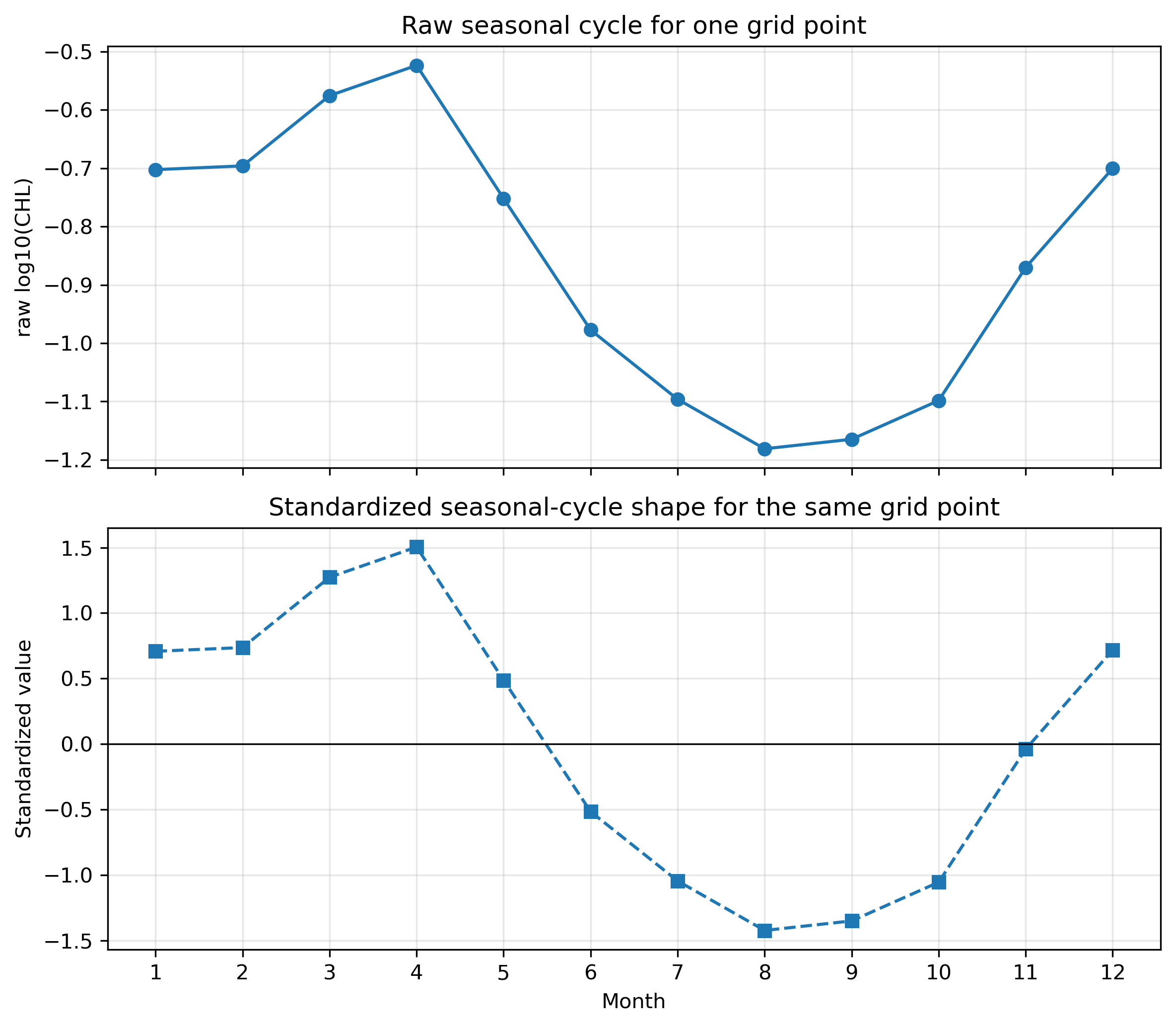
plt.show()STEP 8:1つの格子点で raw と standardized を上下に比較する
# ============================================================
# Pre2 STEP 8
# 1つの格子点で raw と standardized を上下に比較する
# ============================================================

# 例として1つの格子点を選ぶ
one_idx = line_indices_shape[0]
raw_one = X_valid2[one_idx, :]
shape_one = X_shape[one_idx, :]

one_lat = lat_valid2[one_idx]
one_lon = lon_valid2[one_idx]

fig, axes = plt.subplots(2, 1, figsize=(9, 7), sharex=True)

axes[0].plot(months, raw_one, marker="o")
axes[0].set_ylabel("raw log10(CHL)")
axes[0].set_title(f"One grid point: lat={one_lat:.1f}, lon={one_lon:.1f}")
axes[0].grid(True, alpha=0.3)

axes[1].plot(months, shape_one, marker="s", linestyle="--")
axes[1].axhline(0, color="k", linewidth=0.8)
axes[1].set_xlabel("Month")
axes[1].set_ylabel("standardized value")
axes[1].grid(True, alpha=0.3)

plt.xticks(months)
plt.suptitle("Raw vs standardized seasonal cycle for one grid point", y=0.98)
plt.tight_layout()
save_current_figure("pre2_raw_vs_standardized_one_sample_two_panels.png")
plt.show()
STEP 9:次のK-means用に X と X_shape を保存する
# ============================================================
# Pre2 STEP 9
# 次のK-means用に X と X_shape を保存する
# ============================================================

out_npz = base_dir / "pre14_X_for_kmeans.npz"

np.savez(
    out_npz,
    X_valid2=X_valid2,
    X_shape=X_shape,
    lat_valid2=lat_valid2,
    lon_valid2=lon_valid2,
    months=months,
)

print("Saved:", out_npz)
print("次のK-means本編では、このX_shapeを使ってクラスタリングする。")

ds.close()
6. K=5はここで決まるのか
Pre1とPre2を見ても、K=5が数学的に決まるわけではない。むしろ、この前段階の役割は「太平洋には複数の季節変動タイプがありそうだ」と考えることである。
| 候補タイプ | 代表的な海域 | 特徴 |
|---|---|---|
| 低CHL・弱季節変動型 | 北太平洋亜熱帯循環域 | 年平均が低く、季節振幅も小さい。 |
| 赤道型 | 赤道太平洋 | 比較的フラットだが、赤道域特有の変動を持つ。 |
| 北半球中緯度型 | 黒潮周辺 | 春に高く、夏に低くなる傾向。 |
| 南半球中緯度型 | 南太平洋中緯度 | 北半球とは季節がずれる。 |
| 沿岸・湧昇型 | ペルー沿岸など | 沿岸・湧昇の影響を受けやすい。 |
7. スクリプトのダウンロード
授業ではHTML内のセルを順にコピーするのがよいが、教員確認用・復習用として、同じ内容のPythonスクリプトも置いておく。
8. 確認課題
- 1月と8月の地図を比較し、北半球と南半球でどのような違いがあるか説明しなさい。
- 黒潮域、赤道太平洋、亜熱帯循環域の季節変動の違いを説明しなさい。
- 年平均、季節振幅、最大月は、それぞれ海洋学的に何を表しているか説明しなさい。
- X(grid, month) の1行と1列が何を意味するか説明しなさい。
- raw値でクラスタリングする場合と、標準化後にクラスタリングする場合では、何が違うか説明しなさい。
- K=5はこの段階で決まるのか、それとも仮説なのか説明しなさい。
9. まとめ
- クロロフィルは場所によって濃度も季節変動も異なる。
- 1つの格子点には、1月〜12月の12個の値がある。
- 12か月の時系列から、年平均・季節振幅・最大月などの特徴量を作れる。
- K-meansでは、各格子点の12か月時系列を X(grid, month) として扱う。
- 標準化すると、濃度の高低ではなく季節変動の形を比較しやすくなる。